
Saturday, May 23, 2009


Friday, May 15, 2009

Web Analysis
Client's Website
Nandos
-www.nandos.com.my

Competitors Site
TGI Fridays
-www.fridays.com


-www.tonyromas.com

-all using html to do this design
-neat and beautiful arrangement and layout design
-got put some flash to filled in html
-simple but typo can be improved
-easy to read but not interesting
-nothing can make audience go futher to interact this site.
Beautiful Commercial Site
Nike
-nikeid.nike.com

-nice colour skin and background colour.
-the colour very suitable for his brand.
-nice typography and suitable for his brand.
Seoul Communication
-www.seoulcoms.co.kr

-an intersting interactive commercial site.
-nice layout and design.
-they used like 3d item to attract audience view to get interact.
-very cool because when ur mouse rolover the item its will pop out
Nandos
-www.nandos.com

-nice design and layout.
-looks messy drawing but let audience curious to go click it
-cool interaction navigation in every item
-nice graphic drawing design
-they used paper montage to represented their menu bar.
-looks like kids drawing design.
-not suitable for his brand.
Coca Cola
-www.cocacola.com.br

-very nice design and layout
-colour skin and his banner very suitable for coca cola
-using montage to shown 3D outcome
-neat typo but still can be improved but overall is ok
-the art direction very good
HTML/CSS/JavaScript Library Tutorials URL:
http://www.echoecho.com/javascript.htm
http://www.w3schools.com/css/
http://www.htmlcodetutorial.com/
http://www.tizag.com/htmlT/
Design Tutorials URL:
http://www.designtutorials.info/
http://www.allgraphicdesign.com/
http://www.tutorialguide.net/
http://www.grafx-design.com/phototut.html
Nandos
-www.nandos.com.my

Competitors Site
TGI Fridays
-www.fridays.com

-nice design layout and arangement
-got good hierarchy and consistency menu and boxes
-the typo arrangement very neat and easy to read
-they got put some flash to make the layout more interesting
-good colour skin and suitable on their brand.
Chilli's
-www.chillis.com
-simple layout web design and simple typo using verdana or arial fonts
-easy to read for audience
-the colour all using chilli colours to represent their layout design
-easy to access and less is more
Kenny Roger Roaster
-www.krr.com.my

-they used food photo to interact audience to go search for it
-simple menu bar
-the colour skin and layout not suitable for their brand
-too many pop up window
-arrangement text can be more interesting
-www.tonyromas.com

-all using html to do this design
-neat and beautiful arrangement and layout design
-got put some flash to filled in html
-simple but typo can be improved
-easy to read but not interesting
-nothing can make audience go futher to interact this site.
Beautiful Commercial Site
Nike
-nikeid.nike.com

-nice colour skin and background colour.
-the colour very suitable for his brand.
-consistency layout an the prize list.
-its used many shoe picture to give audience hooks to search it more.
-got some interaction can let us go click it.-its used many shoe picture to give audience hooks to search it more.
-nice typography and suitable for his brand.
Seoul Communication
-www.seoulcoms.co.kr

-an intersting interactive commercial site.
-nice layout and design.
-they used like 3d item to attract audience view to get interact.
-very cool because when ur mouse rolover the item its will pop out
Nandos
-www.nandos.com

-nice design and layout.
-looks messy drawing but let audience curious to go click it
-cool interaction navigation in every item
-nice graphic drawing design
-they used paper montage to represented their menu bar.
-looks like kids drawing design.
-not suitable for his brand.
Coca Cola
-www.cocacola.com.br

-very nice design and layout
-colour skin and his banner very suitable for coca cola
-using montage to shown 3D outcome
-neat typo but still can be improved but overall is ok
-the art direction very good
HTML/CSS/JavaScript Library Tutorials URL:
http://www.echoecho.com/javascript.htm
http://www.w3schools.com/css/
http://www.htmlcodetutorial.com/
http://www.tizag.com/htmlT/
Design Tutorials URL:
http://www.designtutorials.info/
http://www.allgraphicdesign.com/
http://www.tutorialguide.net/
http://www.grafx-design.com/phototut.html
Thursday, April 9, 2009


1.how do you think on my design?
a.Nice
b.Overall is ok
c.ugly
d.other comment?
2.was the design consistency?
a.yes
b.no
c.other comment?
3.was the button shown very clear and easy to find?
a.yes
b.no
c.other comment?
4.what intersting on my layout web design?
5.what kind of tutorials would u think from this layout?
tolong me comment ah plz/...........
Thursday, January 22, 2009

Wednesday, January 14, 2009


Wednesday, November 26, 2008
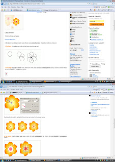
1st interface

 which 1 better....i dnt knw how to do pattern o......giv me comment....
my product is do for shoe ....gao meng ah...
Subscribe to:
Posts (Atom)